Handoff
Mobile App
Visual Identity
UX Design
UI Design
User Research & Testing
Animation
Handoff is a chat-based alcohol delivery app that uses artificial intelligence to help recommend users products for purchase. Working closely with the founders and developers, I led the redesign to develop the look and feel of the brand and increase user retention.
THE PROBLEM
With an unconventional shopping experience, users had the opportunity to interact with a quirky AI that could deliver a similar experience to talking with a beverage expert at your local liquor store. However, users found the interface to be clunky, personality-less, and difficult to understand to the point of being overwhelming. The app lacked the consistency needed to create a seamless and enjoyable experience that would retain new users.
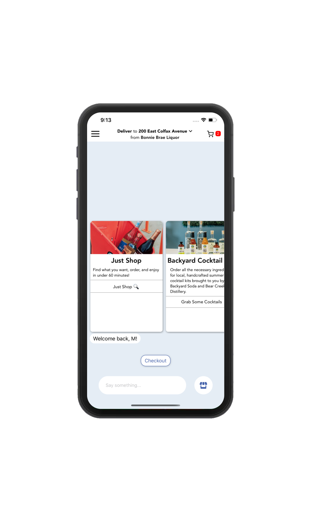
Before – The original home screen was cluttered with too much information, making it difficult for the user to know how to get started. Additionally, it is unclear what action results from clicking certain items.

After – All buttons are relabeled to reflect the action that results from interaction. The card information is moved into a bottom menu that slides up with shopping options.
Message suggestions
Users can immediately begin using the app with the added feature of message suggestions. All options appear above the hatbox and send a message right after pressing.


Improved navigation
All icons are clearly labeled with familiar images and accompanying text. Users can always see where they can exit a page or return to the Home Screen.
Onboarding
The unique AI-chat experience is introduced to users through a quick and minimal onboarding series.

Brand voice
The cheeky personality of the AI-chat responses is reflected in the visual design. Simple tasks become more exciting. The interface is consistently designed for ease of use and aesthetics with lots of opportunities for brand moments.
OUTCOMES
This project gave me the opportunity to combine my UX and visual design skills in a unique product that already reimagines the e-commerce experience. I learned some important takeaways because of the structure of the project.
Rapid ideation and prototyping
I learned how to dial in my prototyping and testing workflow by taking a task-based approach, focusing in on up to three specific tasks and testing with a small pool of users to nail down those specific user flows.
Great UX makes great UI
Although this project was very branding and visual design-heavy, putting most of my time and focus into UX and usability testing is what created such a successful product.
Open communication
Given the sprint nature of the project timeline, I learned that communication between myself and the developers was crucial. In order to meet our tight redesign deadline, we met on a weekly basis to review research, designs, and testing insights.